Wings Framework v0.1
Version 0.1.0 ·
The first Wings Framework release brings layered architecture, ECS widgets, themes, animation, navigation, DI and MVVM to Bevy 0.20.
A framework for applications built with Bevy
Wings Framework v0.1 establishes the foundation for building applications and game interfaces with Bevy. It combines a plain Rust domain layer, a data layer and an ECS presentation layer. The workspace contains 13 library crates, a gallery application and 13 focused examples.
Screens use Bevy’s bsn! scene macro. Widgets, view models, bindings and animations are ordinary ECS components, systems, observers and messages. There is no separate retained widget tree or virtual DOM. Use the facade and its prelude to start quickly, or depend on individual crates when you need only part of the framework.
Compatibility and getting started
Version 0.1.0 targets Bevy 0.20, Rust 1.97.1 or newer, and the Rust 2024 edition. Add WingsUiPlugins after DefaultPlugins. The UI uses Bevy 0.20 scene components, entity events, bevy_ui_widgets, UiTransform and WESL materials directly; older Bevy versions are not supported by this release.
All 13 Wings Framework library crates are published on crates.io at version 0.1.0 under the bevy_wings package family, with underscores in every package name. Add the dependencies below to install the framework, or use individual crates if you need only part of it. The source repository includes the gallery and focused examples.
- The shaders feature is enabled by default. Set default-features = false to omit the facade’s custom shader integration.
- Without shaders, skeletons use an opacity pulse and WingsCircularProgress is unavailable. The remaining widget and application layers still work.
- Interactive examples need a display and a working GPU driver. On Ubuntu/Debian, install libudev-dev, libx11-dev, libxi-dev, libxrandr-dev, libxcursor-dev and libxkbcommon-dev.
- Use WingsWidgetsPlugin::headless() for tests and applications without a renderer.
[dependencies]
bevy = "0.20"
bevy_wings = "0.1"
Thirteen crates with clear responsibilities
Dependencies point toward the domain. Business rules can remain independent of Bevy; data sources implement domain repository contracts, and the presentation layer calls use cases and renders their results. Dependency injection connects implementations to the contracts they satisfy.
The facade re-exports every layer and provides WingsUiPlugins for core, animation, theme, responsive layout, modifiers, shaders and widgets. Dependency injection and navigation are configured separately because their definitions and destinations belong to your application. The domain crate has no dependencies.
Library crates
| bevy_wings | Facade, shared prelude and WingsUiPlugins |
| bevy_wings_domain | Entities, use cases, validation and repository contracts |
| bevy_wings_data | Data sources, offline caching and background loading |
| bevy_wings_di | Dependency injection, modules and scopes |
| bevy_wings_ui_core | System ordering, reactive state and subtree opacity |
| bevy_wings_ui_animation | Tweens, springs, keyframes and visibility transitions |
| bevy_wings_ui_theme | Theme tokens, painting and the embedded Inter font |
| bevy_wings_ui_responsive | Breakpoints, responsive layout and UI scaling |
| bevy_wings_ui_modifiers | Fluent layout and styling modifier chains |
| bevy_wings_ui_shaders | Ripple, shimmer, progress, aurora and glass materials |
| bevy_wings_ui_widgets | Themed widgets and interaction feedback |
| bevy_wings_ui_mvvm | View models, bindings, intents and effects |
| bevy_wings_ui_navigation | Typed back stacks, destinations and adaptive panes |
Domain: entities, validation and use cases
The domain crate supplies reusable application contracts without an engine dependency. Keep validation and use cases here so the same business rules can be used from UI code, tools or a server.
- Id<T> provides typed identifiers, and DomainEntity gives repositories a consistent entity identity.
- UseCase supports dedicated types and closure implementations. DomainError includes field errors and retryable error classification.
- Validator<T> reports every broken rule rather than stopping at the first failure, with reusable rules for common checks.
- ReadRepository and WriteRepository define storage contracts, with default paging and require helpers. PageRequest and Page<T> represent paged results.
- Loadable<T> preserves the previous successful value during refreshes and after failures, so loading does not have to blank the screen.
Data: offline reads, queued writes and background loads
OfflineFirstRepository combines local and remote sources with cache-first, remote-first, cache-only and remote-only policies. Freshness uses a time to live and an injectable clock. When the remote is unavailable, cached stale data can still be served.
Offline writes update local state immediately, enter a queue and are delivered by sync() after reconnecting. Single-entity remote reads also respect pending saves and deletes: a stale remote snapshot cannot overwrite an unsynchronized edit or restore an entity queued for deletion.
- DataSource and RemoteSource define the interfaces. MemorySource is thread safe; FakeRemote supports an offline switch and request counting for tests.
- Mapper converts transfer objects into domain entities.
- Background loads run on Bevy’s async compute pool. WingsLoadable<T> stores the state on an entity, and WingsLoadFinished signals completion.
- File/database persistence and an HTTP remote implementation are future work. Version 0.1 supplies contracts and in-memory implementations rather than a bundled production backend.
Core: predictable frame ordering and reactive state
WingsUiSystems orders Input, ViewModel, Bind, Navigation, Responsive, Modifier, Style, Theme and Animate work. WingsCorePlugin and ensure_core let individual plugins establish the shared schedule when used on their own.
- WingsState<T> is a versioned value: setting an equal value does not bump its version.
- WingsMemo<T> caches derived values by source version, avoiding repeated work when the source is unchanged.
- WingsOpacity applies clamped opacity through a subtree. Hierarchy helpers find ancestors and the closest matching component.
Widgets: layout, input, feedback and screen structure
Widgets are bsn! scene components that expand into ordinary Bevy entities. They express colors and shapes as theme roles, so a theme change can repaint a whole screen. Shared systems handle hover, press and disabled feedback, while observers handle actions.
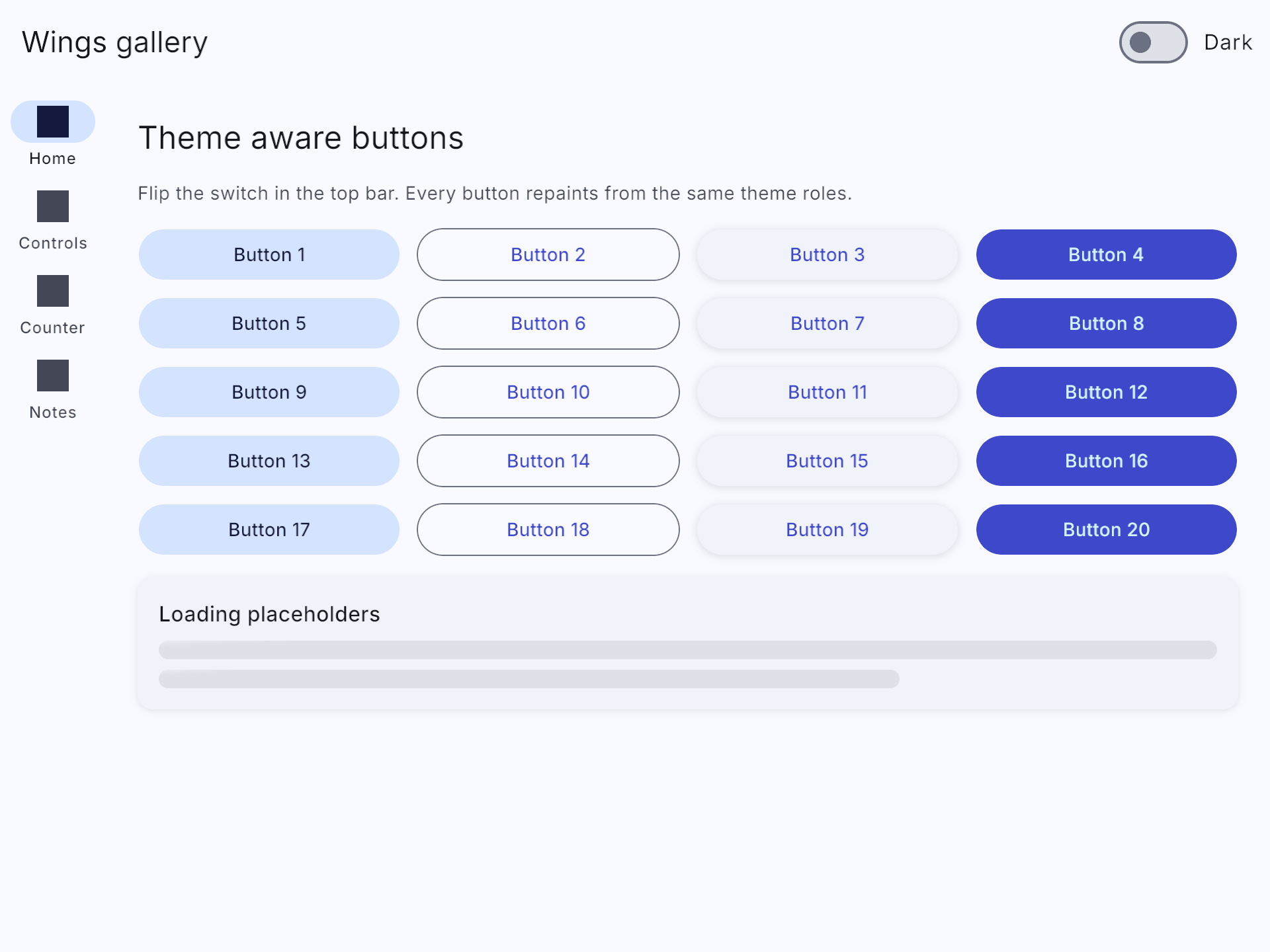
The initial set covers common application interfaces, including text fields with value-change events and focus outlines, animated switches, sliders, progress indicators, snackbars and dialogs with result events. Sliders support dragging and clicking the track to move directly to a position, including the track endpoints. Radio buttons and groups support exclusive selection, including clicks on option labels. Buttons support six variants, icons, disabled state, full width and runtime variant changes.
- Text and icons: WingsText and WingsIcon, including inherited content tint.
- Layout: WingsColumn, WingsRow, WingsBox, WingsSpacer, WingsDivider, WingsScrollColumn and WingsGrid.
- Surfaces and actions: WingsSurface, elevated/filled/outlined WingsCard, WingsButton, WingsIconButton and small/regular/large/extended WingsFab.
- Selection and input: WingsCheckbox, WingsSwitch, WingsRadioGroup, WingsRadioButton, WingsSlider, WingsChip and WingsTextField. Checkboxes trace their check mark as if written by hand: the short stroke draws first, then the long stroke continues to the tip over 220 ms. Unchecking erases the path in reverse, replacing the previous circular mark.
- Feedback: WingsLinearProgress, shader-enabled WingsCircularProgress, WingsSkeleton, WingsBadge, WingsDialog and snackbar messages, hosts, actions and auto-hide behavior.
- Screen structure: WingsScaffold, WingsTopAppBar, WingsListItem, WingsNavigationBar, WingsNavigationRail and WingsNavigationItem. Bars and rails adapt to width, and items report exclusive selection.
Build a set of interactive controls
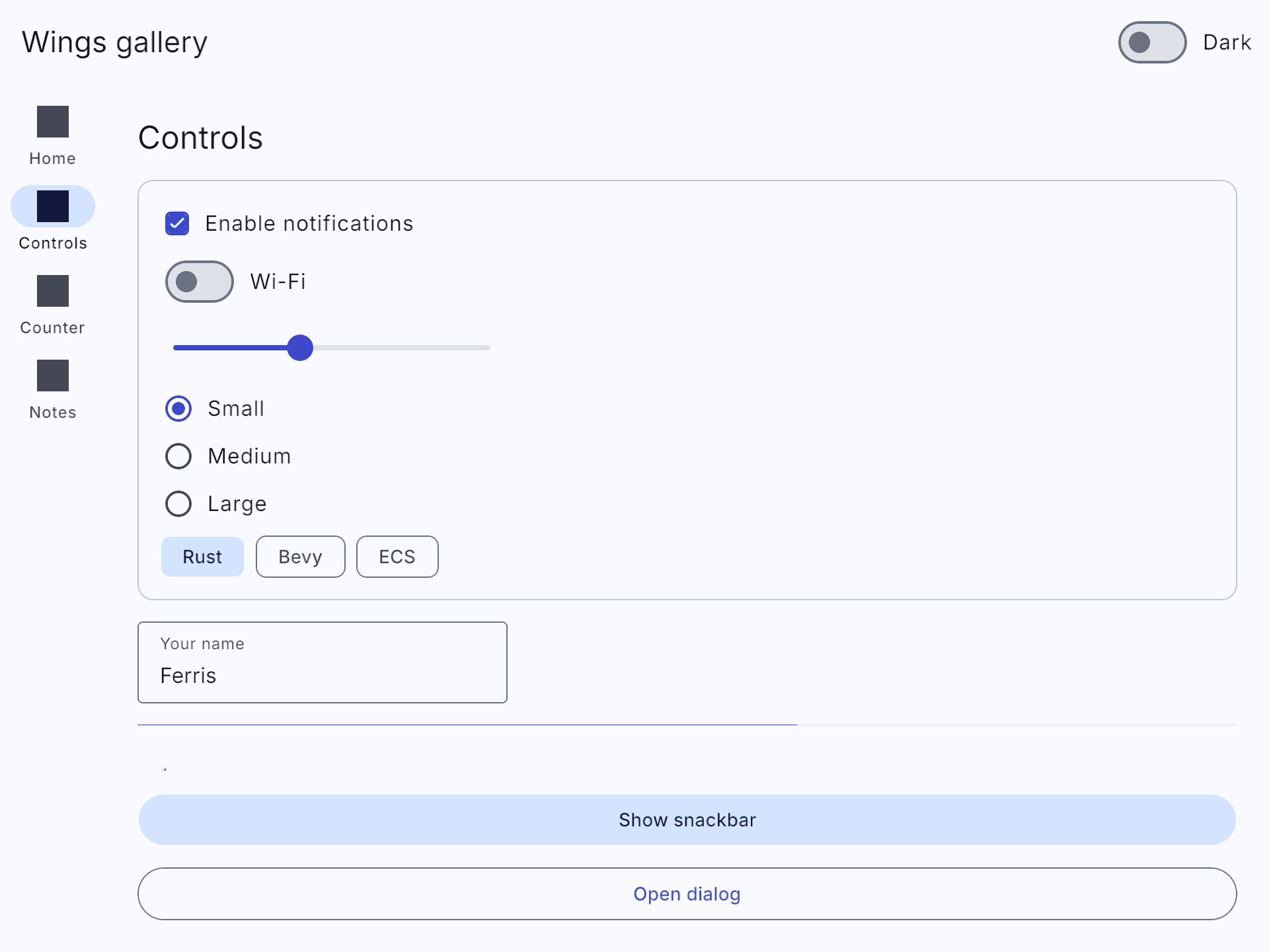
Inside setup, spawn a scene like this. Widgets inherit theme colors and Inter typography; the slider reports changes from both track clicks and dragging.
fn setup(mut commands: Commands) {
    commands.spawn_scene(bsn! {
        @WingsScaffold
        Children [
            @WingsColumn { @padding: 24.0, @gap: 16.0 }
            Children [
                @WingsCheckbox { @label: "Notifications", @checked: true }
                --
                @WingsSwitch { @label: "Wi-Fi" }
                --
                @WingsRadioGroup { @gap: 8.0 }
                Children [
                    @WingsRadioButton { @label: "Small", @checked: true }
                    --
                    @WingsRadioButton { @label: "Large" }
                ]
                --
                @WingsSlider { @value: 0.5 }
                on(|change: On<ValueChange<f32>>| {
                    println!("Value: {:.2}", change.value);
                })
                --
                @WingsTextField { @label: "Your name", @value: "Ferris" }
                --
                @WingsLinearProgress { @progress: 0.65 }
            ]
        ]
    });
}
cargo run --example widgets · Complete example source
Theme: semantic tokens and Inter as the default font
WingsTheme supplies light and dark schemes, seeded Oklch palettes, 38 built-in color roles plus custom roles, 15 typography roles, and shape, spacing, elevation and motion tokens. Components store semantic roles rather than hardcoded colors.
The painter resolves background, text, border and inherited content colors, blends interaction state layers and applies box shadows. It repaints the whole themed UI when the theme changes and otherwise processes changed entities. Theme switching can cross-fade, and WingsLocalTheme supports light or dark subtrees.
Inter’s variable font is embedded in the theme crate and installed as the application’s implicit default before UI layout. It requires no separate font file in an assets directory. Explicit font assets remain available, and WingsTypography.font lets an app choose a custom themed font. The bundled font includes its SIL Open Font License and provenance.
Light, dark and system modes are included. The OS-following logic is covered with a simulated window; behavior on a real operating system still depends on the window integration.
Switch themes from a button
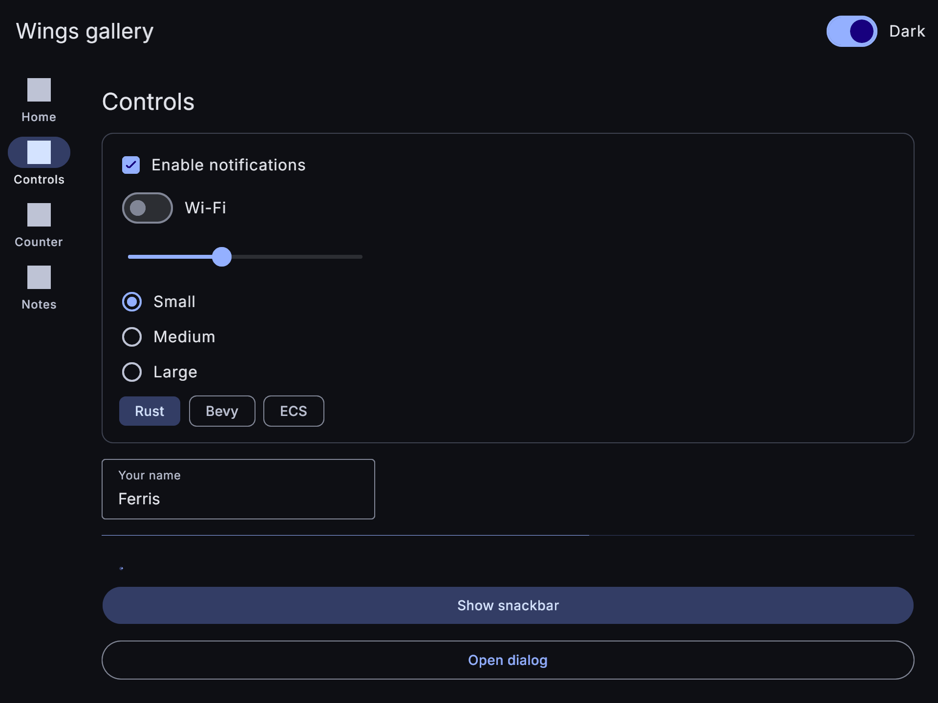
Add this button to a scene’s Children list. A resource mutation repaints every widget using theme roles, including their text, borders and surfaces.
@WingsButton { @text: "Toggle light / dark" }
on(|_: On<Activate>, mut theme: ResMut<WingsTheme>| {
    theme.toggle_dark();
})
cargo run --example theme · Complete example source
Compose-like modifier chains, expressed as ECS components
WingsModifier and the modifier() helper provide a fluent chain for size, padding, margin, flex weight, paint, borders, shape, elevation, transforms, opacity, clipping, stacking and hover scaling. Attach the chain alongside a widget inside bsn!, or include it in a commands.spawn bundle.
A modifier is folded into Bevy UI components only when it changes. Later operations win over earlier assignments. Theme paint operations keep their semantic roles, so they follow theme changes. This is a Compose-like API implemented as field assignments; it does not reproduce every layout-wrapping behavior of Compose. Removing an operation does not restore the previous field value.
Widget props establish the initial scene; modifier components apply styling and layout afterward. The quick start below shows the modifier explicitly on the content column.
use bevy::prelude::*;
use bevy_wings::prelude::*;

fn main() {
    App::new()
        .add_plugins(DefaultPlugins)
        .add_plugins(WingsUiPlugins)
        .add_systems(Startup, setup)
        .run();
}

fn setup(mut commands: Commands) {
    commands.spawn(Camera2d);
    let content = modifier().fill_max_width().padding(24.0);
    commands.spawn_scene(bsn! {
        @WingsScaffold
        Children [
            @WingsTopAppBar { @title: "Hello Wings" }
            --
            @WingsColumn { @gap: 12.0 }
            content
            Children [
                @WingsText {
                    @text: "Welcome",
                    @role: TypeRole::HeadlineMedium
                }
                --
                @WingsButton { @text: "Toggle dark theme" }
                on(|_: On<Activate>, mut theme: ResMut<WingsTheme>| {
                    theme.toggle_dark();
                })
            ]
        ]
    });
}
Style a card with a fluent modifier chain
Attach the chain as a component beside the widget. Size, padding, paint, rounded corners, elevation and hover scaling compose in one expression.
fn setup(mut commands: Commands) {
    let style = modifier()
        .width(360.0)
        .padding(32.0)
        .background(ColorRole::PrimaryContainer)
        .shape(ShapeRole::Large)
        .elevation(3)
        .hover_scale(1.08);

    commands.spawn_scene(bsn! {
        @WingsScaffold
        Children [
            @WingsColumn { @padding: 48.0, @gap: 24.0 }
            Children [
                @WingsText { @text: "Hover the card" }
                --
                Node style bevy::picking::hover::Hovered
                Children [
                    @WingsText { @text: "Styled with modifiers" }
                ]
            ]
        ]
    });
}
cargo run --example modifiers · Complete example source
Animation: tweens, physical springs and transitions
AnimationSpec supports tweens, duration presets, physical springs, snap, delay and stagger. The easing set includes cubic Bézier, back, elastic, bounce, steps and Bevy EaseFunction integration. Repeat modes cover once, a fixed count, infinite and ping-pong.
Springs use fixed substeps and retain velocity when retargeted, so a new target can be applied while an animation is already moving. WingsLerp supports scalar and vector values, Oklab color interpolation, rotations, Val and tuples.
- Animate background/text/border colors, scale, rotation, translation, width, height and opacity. Implement WingsProperty and register_wings_property for your own fields.
- Entity command extensions start, explicitly initialize or stop animations. WingsAnimationFinished reports completion, and WingsAnimatedValue<T> supports standalone animated values.
- Keyframes have per-segment easing and shake, heartbeat and blink presets. WingsAnimatedVisibility provides fade, scale and slide entry/exit transitions.
Retarget a spring animation
Attach AnimatedCard and UiTransform to the card you want to animate. Place this button in the same scene; clicking it again retargets the spring while preserving its velocity.
#[derive(Component, Default, Clone)]
struct AnimatedCard;

// Inside a bsn! Children list:
@WingsCard AnimatedCard UiTransform
Children [ @WingsText { @text: "A spring-driven card" } ]
--
@WingsButton { @text: "Toggle scale" }
on(|_: On<Activate>, mut commands: Commands,
    cards: Query<(Entity, &UiTransform), With<AnimatedCard>>| {
    for (entity, transform) in &cards {
        let target = if transform.scale.x > 1.1 { 1.0 } else { 1.25 };
        commands.entity(entity).animate::<ScaleProperty>(
            Vec2::splat(target), AnimationSpec::spring(),
        );
    }
})
cargo run --example animation · Complete example source
Responsive layout: adapt to the space available
Width classes cover compact, medium, expanded, large and extra large windows, with configurable breakpoints, height classes and orientation. The viewport comes from the primary window or WingsViewportOverride for controlled layouts and tests.
WingsResponsive<T> chooses values per class with fallback. Responsive node patches, visibility, grid columns, component values and automatic UI scaling let one scene adapt as the window changes. WidthClassChanged and the width_at_least run condition expose breakpoint changes to application systems.
Adapt a grid to the window width
Create the columns component in setup, then attach it to WingsGrid. The same four cards use one, two, three or four columns as the available width changes.
let columns = WingsResponsiveColumns(
    WingsResponsive::new(1).medium(2).expanded(3).large(4),
);

// Inside a bsn! Children list:
@WingsGrid { @gap: 16.0 } columns
Children [
    @WingsCard Children [ @WingsText { @text: "One" } ]
    --
    @WingsCard Children [ @WingsText { @text: "Two" } ]
    --
    @WingsCard Children [ @WingsText { @text: "Three" } ]
    --
    @WingsCard Children [ @WingsText { @text: "Four" } ]
]
cargo run --example responsive · Complete example source
Five custom UI shader effects
The shader crate contains WESL materials for pointer ripples, skeleton shimmer, circular progress, animated aurora backgrounds and procedural frosted-glass panels. The materials include rounded-corner antialiasing and their own uniform layouts.
All five shader sources are validated with Naga, and their layouts are checked against the Rust material structs. This release also fixes the shared Globals binding to fit Bevy’s actual binding size, eliminating a GPU pipeline validation error caused by extra padding.
The glass effect is procedural; sampling and blurring the content behind a panel is future work. Headless shader examples construct materials, but validating rendered appearance and pointer-driven ripples requires a real window and GPU.
Choose whether a button has a ripple
With the default shaders feature, buttons use pointer ripples. Add WingsNoRipple to an individual button to disable the effect when spawning it.
// Inside a bsn! Children list:
@WingsButton { @text: "Save without a ripple" }
WingsNoRipple
cargo run --example shaders · Complete example source
Dependency injection: reusable definitions and scoped lifetimes
Modules support lazy and eager singletons, existing instances, factories, scoped definitions and parameterized creation. Named qualifiers and trait-object bindings make it possible to register several implementations and select the one a use case needs.
Cycle detection produces readable resolution chains. Duplicate definitions are rejected unless an override is explicit, and verify() resolves definitions in tests. Inject<T>, world extensions and entity scopes connect the container to Bevy; scopes close when their owning entities are despawned.
MVVM: component view models, bindings and intents
WingsViewModel is a component contract with an on_cleared lifecycle. Text, visibility, enabled, checked and generic component bindings resolve the closest view model in the hierarchy and write only when it changes. Bevy’s own change detection provides the reactivity.
on_activate and on_vm translate UI actions into intents. One-shot effects are drained into messages. The DI container can create view models and scope them to navigation entries, and bindings and intents can be expressed directly inside bsn! scenes.
Bind a counter to text and button intents
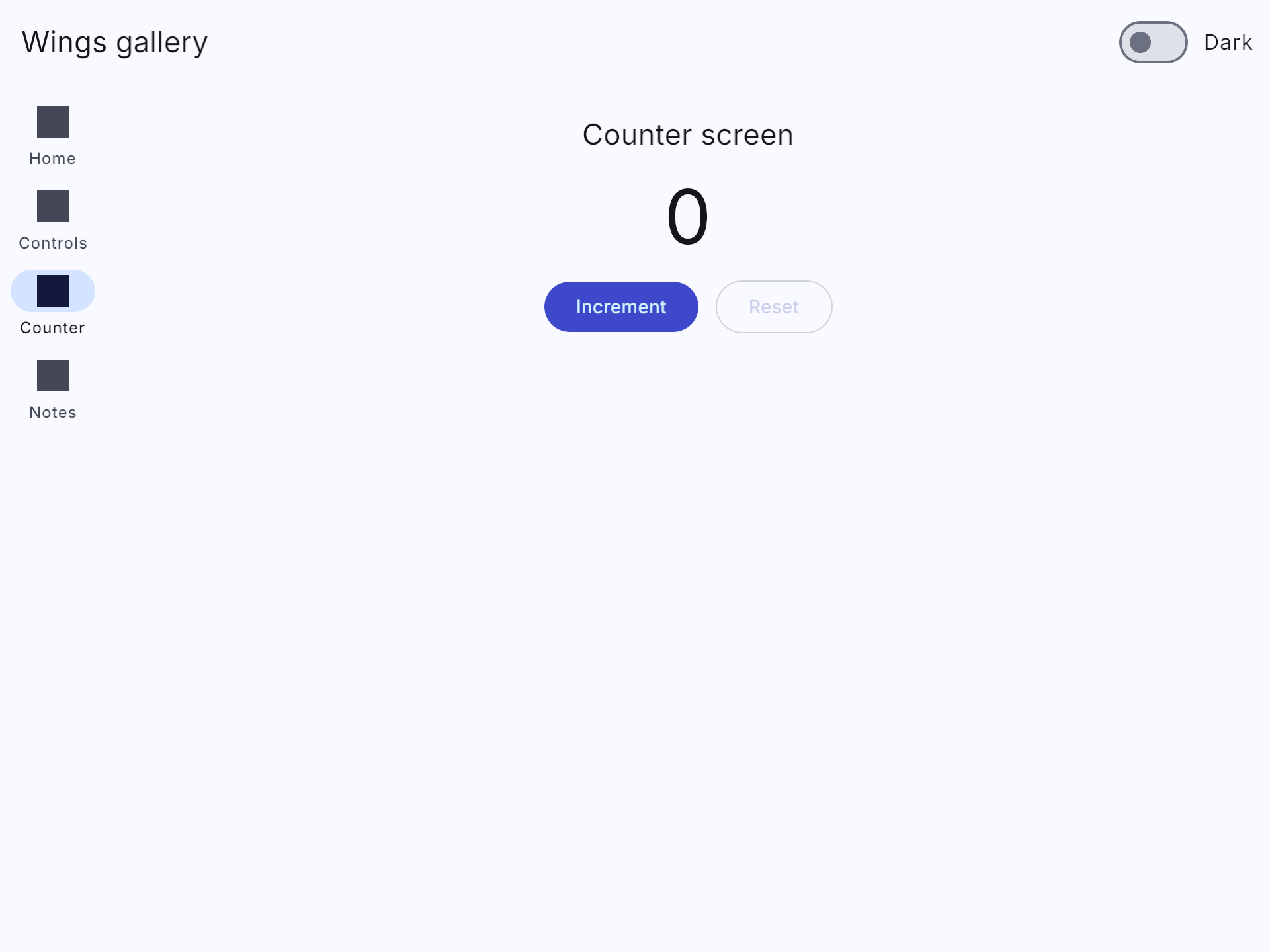
Register Counter with app.register_view_model::<Counter>() before startup. The text binding finds the view model on its ancestor and updates when Increment changes its count.
#[derive(Component, Default, Clone)]
struct Counter { count: u32 }
impl WingsViewModel for Counter {}

fn setup(mut commands: Commands) {
    let label = bind_text(|vm: &Counter| format!("Count: {}", vm.count));
    commands.spawn_scene(bsn! {
        @WingsScaffold Counter
        Children [
            @WingsColumn { @padding: 32.0, @gap: 16.0 }
            Children [
                @WingsText { @role: TypeRole::HeadlineMedium } label
                --
                @WingsButton { @text: "Increment" }
                on(on_activate(|vm: &mut Counter| vm.count += 1))
            ]
        ]
    });
}
cargo run --example mvvm · Complete example source
A gallery and thirteen focused examples
The gallery combines navigation, dependency injection and MVVM. Its Notes screen loads through a domain use case and an offline-first repository. The focused examples isolate individual features so you can inspect and run them without following the entire gallery application.
The code examples above use bevy::prelude::* and bevy_wings::prelude::*, with DefaultPlugins, WingsUiPlugins and a Camera2d as in the complete quick start. Scene fragments are labeled with where to insert them; follow each source link for a complete runnable program. Run the commands below from the framework repository root. Domain, data, DI and state run in the terminal; the UI examples open a 960 × 720 window. Append -- --headless to a focused UI example to run 120 fixed frames without a window. The shaders example requires the shaders feature.
cargo run -p wings-gallery
cargo run --example modifiers
cargo run --example mvvm -- --headless
cargo run --example widgets --no-default-features -- --headless
Focused examples
| cargo run --example domain | Typed IDs, validation and a domain use case | Terminal |
| cargo run --example data | Cached reads, offline writes and reconnect synchronization | Terminal |
| cargo run --example di | Singletons, factories and scoped services | Terminal |
| cargo run --example state | Versioned reactive state and memoization | Terminal |
| cargo run --example loading | Background loading, refresh and failure handling | Window |
| cargo run --example animation | Spring scaling and retargeting while in motion | Window |
| cargo run --example theme | Light/dark switching and seeded colors | Window |
| cargo run --example responsive | Grid columns that adapt to window width | Window |
| cargo run --example modifiers | Layout, paint, shape, elevation and hover scale | Window |
| cargo run --example widgets | Animated checkboxes, radio groups, slider clicks, input and snackbars | Window |
| cargo run --example mvvm | Counter intents and automatic text bindings | Window |
| cargo run --example navigation | Detail destinations, back navigation and adaptive panes | Window |
| cargo run --example shaders | All five shader effects, including button ripples | Window; shaders feature |
Validation and release automation
The v0.1 validation run passes 208 unit, integration and example tests with all features, and 205 in the configuration without shaders. Nine documentation tests pass; 27 illustrative snippets are explicitly ignored. Formatting, Clippy with warnings denied, documentation builds and Rust 1.97.1 compatibility checks pass. All 13 library packages pass a workspace publication dry run.
Native GPU startup checks were also run for the focused UI examples, including the corrected shader bindings and embedded font. These checks complement the automated headless tests; they do not replace exhaustive interaction or screenshot-based visual testing.
GitHub Actions is configured to run Linux/macOS checks, a separate no-shaders job, minimum-Rust-version validation, metadata checks and package verification. Publication is triggered by a matching vX.Y.Z GitHub release or an explicit manual tag run, waits for CI, and uploads the library crates in dependency order using a repository token. The gallery is not published as a crate.
cargo test --workspace --all-targets --all-features --locked
cargo test --workspace --exclude wings-gallery --all-targets --no-default-features --locked
cargo test --workspace --doc --all-features --locked
cargo clippy --workspace --all-targets --all-features --locked -- -D warnings
cargo fmt --all -- --check
Current limits and what comes next
Version 0.1 is the first public API iteration. It provides the application foundation and common controls; it does not yet include a production persistence backend, virtualized collections, deep-link restoration or every desktop/mobile widget. Future releases may refine the API as real applications exercise it.
The Wings Framework book now provides twelve practical chapters, exercises and checkpoints alongside the repository README, crate documentation and runnable examples. The following items are planned directions, not features included in v0.1 or delivery-date commitments.
- File/database sources, an HTTP remote source, entity serialization and use-case retry/timeout/logging decorators.
- Loadable bindings, .bsn assets when supported by Bevy, and virtualized lists and grids.
- Navigation results, deep links, back-stack persistence and shared-element transitions.
- Tabs, segmented controls, menus, tooltips, pickers and sheets.
- Focus styling, right-to-left layouts, theme assets with hot reload and gamepad polish.
- More shader effects, large-widget-count benchmarks and GPU screenshot regression tests.
License and contributing
The framework source is MIT licensed. The embedded Inter font is distributed under the SIL Open Font License, included with the font in the theme crate. Individual crates can be adopted independently.
Use the GitHub repository to follow development, report reproducible issues and propose changes. When reporting a UI issue, include the Bevy and Rust versions, operating system, enabled features and the smallest example that demonstrates the behavior.